Beyond the Trends: The 4 Unchanging Pillars of Great Retail Signage
In the fast-moving world of retail, keeping up with new design trends and technology is a big part of creating an exciting brand experience.
But the most successful spaces always balance those innovations with solid, timeless fundamentals.
No matter how much technology changes, the core job of your signage stays exactly the same, it’s there to guide your customers, help them find what they need, and make their shopping trip easy and enjoyable. When you get these basics right, everything else falls into place and you have solid foundations to be creative from.
If you’re planning your next store layout or a multi-site rollout, here are the four unchanging pillars of retail signage to keep in mind.
1. Clear Information Hierarchy
Think of your signage as a map that layers information. A customer should be able to walk into your store and understand the layout in just a few seconds.
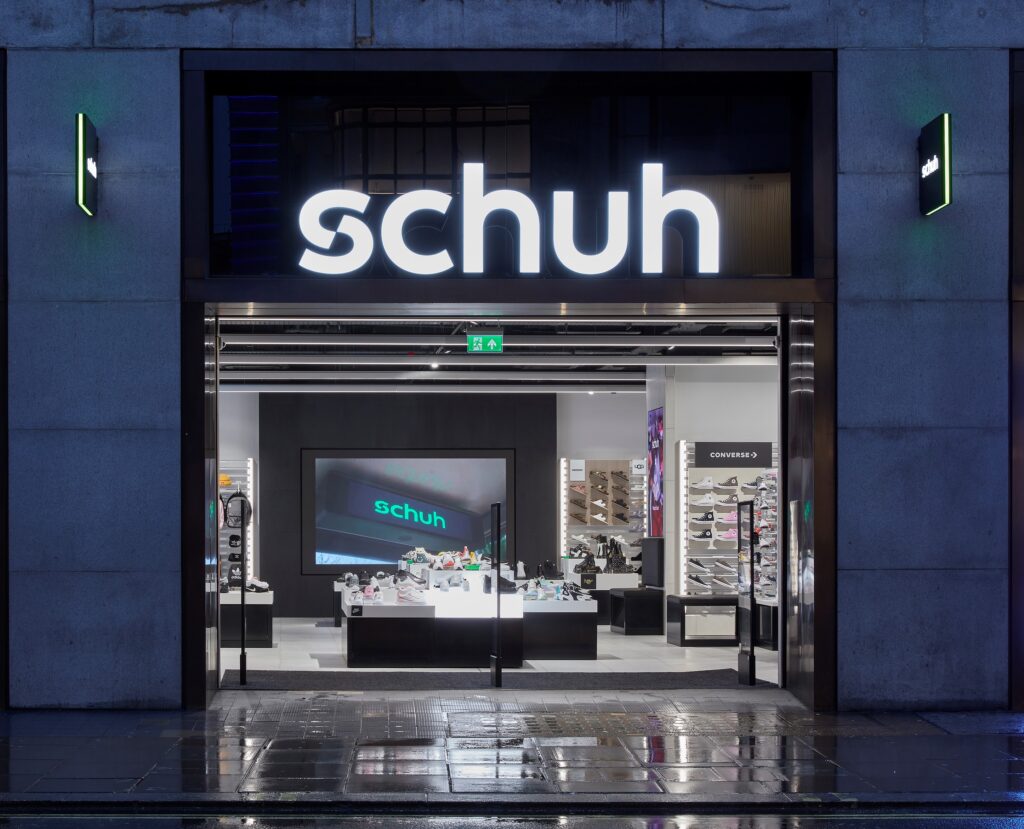
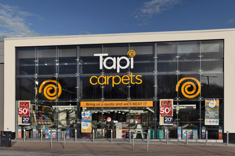
- Storefront Signage: This is your first handshake. It lets people know exactly who you are and invites them to step inside.
- Wayfinding & Departmental Signs: Once they’re through the door, customers need a bit of direction. Clean, high-level signs help them navigate to main areas, such as menswear, home goods, or the changing rooms, without getting frustrated.
- Category & Product Signs: When they reach the right aisle, the signage gets more specific. This is where you clearly communicate pricing, features, and product choices right at the shelf edge.

2. Easy Readability and Good Contrast
It sounds simple, but if a shopper has to squint or pause to figure out what a sign says, it’s not doing its job. Legibility from a distance is everything.
- High Contrast: The simplest rules are often the most important. Using dark text on a light background, or vice versa, makes sure your signs are easy to read under any kind of store lighting.
- Clean Fonts: While stylized or script fonts can look great on a design board, clean, sans-serif lettering makes your store accessible to everyone, including elderly shoppers or anyone with visual impairments.
- Sizing for Distance: Text needs to match the scale of the room. A good rule of thumb we use is ensuring the lettering is large enough to be read comfortably from wherever the customer will realistically be standing.
3. Total Brand Consistency
Your signage acts like a silent member of your team. Every sign across every location needs to look like it belongs to the same family and speaks with the same voice.
- Visual Identity: If you’ve worked hard to build a recognizable brand, your signs need to reflect that. That means perfectly matching your logos, exact corporate colour palettes, and approved fonts across every single material and finish.
- A Unified Voice: The language on your signs should match your brand’s personality. Whether your shop is meant to feel playful and friendly, strictly functional, or high-end and premium, the tone should stay the same from the entrance to the till.

4. Smart Placement and Sightlines
The best-designed sign won’t work if it’s tucked away where people don’t naturally look. Placement should always be a deliberate choice, never an afterthought.
- The Eye-Level Rule: Important details like promotions, pricing, and main directions should sit naturally between 4 and 5 feet off the ground. This is the sweet spot where the human eye naturally travels when browsing.
- Give it some Breathing Room: Visual fatigue is real, especially in busy stores. Leaving enough “white space” around your signs helps customers process the information quickly without feeling overwhelmed by visual clutter.
Getting the Basics Right
At Widd, we’ve spent 138 years manufacturing and installing retail signage. If there’s one thing we’ve learned over the years, it’s that a beautiful creative concept only works if it respects these simple, everyday principles.
Before we look at the latest materials or technical features, we always make sure the fundamentals are rock solid. That’s how you build a retail space that looks fantastic on opening day and keeps working beautifully for years to come.
Planning a flagship refresh or a multi-site rollout? We’re always happy to chat through your ideas and help you bring them to life with straightforward, end-to-end support.